

My team and I have just finished redesigning the navigation menu and homepage of theunified.space. The new design is intended to simplify navigation and make it easier for visitors to find the information they need.
This is the second time we’ve done the redesign, the first time we opted for a side navigation menu (see fb post), but in the end we decided to redesign the navigation menu once more and improve it even more.
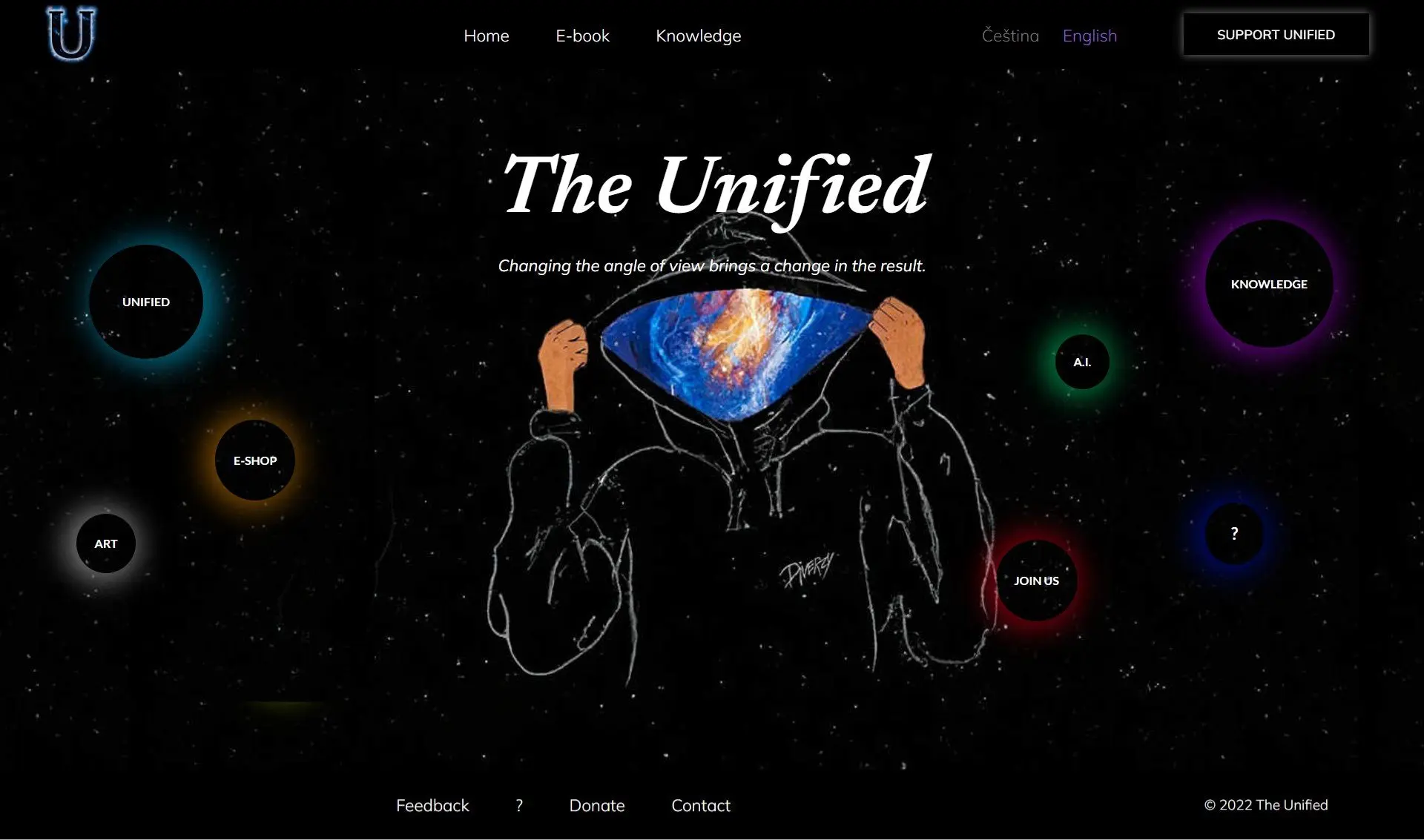
The new navigation menu is now organized by content. Additionally, we did an effect on the buttons where when you point at a button, the image changes. The homepage has been simplified and includes buttons for the topics.
We hope you like the new design. As always, feel free to contact us if you have any questions.